Breaking Down the $655 Million World Cup Prize Money

Published
21 hours agoon
July 19, 2026 Graphics & Design Breaking Down the $655 Million World Cup Prize Money
The 2026 FIFA World Cup is awarding $655 million in performance prize money, making it the richest tournament in the competition’s history. Every stage of the tournament came with a larger financial reward, giving teams another incentive to advance as far as possible. Performance prize money has increased nearly 50% since 2022, when FIFA awarded $440 million.
This Markets in a Minute graphic, created in partnership with Terzo, breaks down how the $655 million performance prize pool is distributed across every stage of the tournament. From group stage participants to the eventual champion, it shows the earnings of every qualifying country.
Spain Takes Home the World CupSpain captured the 2026 FIFA World Cup title and the tournament’s top prize of $50 million, while runner-up Argentina earned $33 million. It marks Spain’s second World Cup championship after previously lifting the trophy in 2010, capping off an impressive tournament run that also included victories over Belgium and France in the knockout stage.
| First Place | 🇪🇸 Spain | 50 |
| Second Place | 🇦🇷 Argentina | 33 |
| Third Place | 🇬🇧 England | 29 |
| Fourth Place | 🇫🇷 France | 27 |
| Quarter Finalist | 🇲🇦 Morocco | 19 |
| Quarter Finalist | 🇧🇪 Belgium | 19 |
| Quarter Finalist | 🇳🇴 Norway | 19 |
| Quarter Finalist | 🇨🇭 Switzerland | 19 |
| Round of 16 Exit | 🇨🇦 Canada | 15 |
| Round of 16 Exit | 🇵🇾 Paraguay | 15 |
| Round of 16 Exit | 🇧🇷 Brazil | 15 |
| Round of 16 Exit | 🇲🇽 Mexico | 15 |
| Round of 16 Exit | 🇵🇹 Portugal | 15 |
| Round of 16 Exit | 🇺🇸 United States | 15 |
| Round of 16 Exit | 🇪🇬 Egypt | 15 |
| Round of 16 Exit | 🇨🇴 Colombia | 15 |
| Round of 32 Exit | 🇿🇦 South Africa | 11 |
| Round of 32 Exit | 🇳🇱 Netherlands | 11 |
| Round of 32 Exit | 🇯🇵 Japan | 11 |
| Round of 32 Exit | 🇩🇪 Germany | 11 |
| Round of 32 Exit | 🇨🇮 Ivory Coast | 11 |
| Round of 32 Exit | 🇸🇪 Sweden | 11 |
| Round of 32 Exit | 🇪🇨 Ecuador | 11 |
| Round of 32 Exit | 🇨🇩 DR Congo | 11 |
| Round of 32 Exit | 🇸🇳 Senegal | 11 |
| Round of 32 Exit | 🇧🇦 Bosnia and Herzegovina | 11 |
| Round of 32 Exit | 🇦🇹 Austria | 11 |
| Round of 32 Exit | 🇭🇷 Croatia | 11 |
| Round of 32 Exit | 🇩🇿 Algeria | 11 |
| Round of 32 Exit | 🇦🇺 Australia | 11 |
| Round of 32 Exit | 🇬🇭 Ghana | 11 |
| Round of 32 Exit | 🇨🇻 Cape Verde | 11 |
| Group Stage Exit | 🇨🇿 Czechia | 9 |
| Group Stage Exit | 🇰🇷 South Korea | 9 |
| Group Stage Exit | 🇶🇦 Qatar | 9 |
| Group Stage Exit | Scotland | 9 |
| Group Stage Exit | 🇭🇹 Haiti | 9 |
| Group Stage Exit | 🇹🇷 Türkiye | 9 |
| Group Stage Exit | 🇨🇼 Curaçao | 9 |
| Group Stage Exit | 🇹🇳 Tunisia | 9 |
| Group Stage Exit | 🇮🇷 Iran | 9 |
| Group Stage Exit | 🇳🇿 New Zealand | 9 |
| Group Stage Exit | 🇺🇾 Uruguay | 9 |
| Group Stage Exit | 🇸🇦 Saudi Arabia | 9 |
| Group Stage Exit | 🇮🇶 Iraq | 9 |
| Group Stage Exit | 🇯🇴 Jordan | 9 |
| Group Stage Exit | 🇺🇿 Uzbekistan | 9 |
| Group Stage Exit | 🇵🇦 Panama | 9 |
The final remained scoreless through 90 minutes, despite Spain controlling much of the play and Argentina finishing regulation with 10 men. The deadlock finally broke in the 106th minute, when Ferran Torres scored just after the start of the second period of extra time.
Raising the World Cup StakesEngland ultimately earned $29 million by defeating France 6–4 in the third-place playoff. Bukayo Saka scored a hat trick as England survived a four-goal French comeback. France collected $27 million, while Kylian Mbappé scored twice and finished the match as the World Cup’s all-time leading scorer.
The four quarterfinal exits each earned $19 million. Morocco lost to France. Belgium fell after Mikel Merino scored Spain’s winner in the 88th minute. Norway led England through Andreas Schjelderup, but two Jude Bellingham goals completed a comeback. Switzerland pushed Argentina into extra time before falling.
Reaching the Last Eight Pays OffAdvancing deep into the World Cup delivers meaningful financial rewards. Teams eliminated in the Round of 16 received $15 million. Reaching the Round of 32 was worth $11 million, compared with $9 million for a group stage exit.
The expanded 48-team format means more nations share in FIFA’s record prize pool. Still, every knockout victory unlocks a larger payout, making each match increasingly valuable.
Every Win CountsWorld Cup prize money has never been higher, reflecting the tournament’s growing commercial success. But for national federations and organizations alike, maximizing value isn’t just about generating more revenue. It’s also about making the most of every dollar that’s earned.
That’s true in business as well. While companies focus on growing the top line, improving profitability often starts with controlling the costs hidden in everyday contracts.

Big payouts are earned. Terzo helps businesses keep more of theirs.

 Housing1 week ago
Where U.S. Home Prices Have Outpaced Income the Most
Housing1 week ago
Where U.S. Home Prices Have Outpaced Income the Most
See where home prices have risen far faster than incomes across U.S. metro areas, with Bend, Oregon leading the nation since 1990.

 Education3 weeks ago
Ranked: America’s 20 Lowest-Paying College Degrees
Education3 weeks ago
Ranked: America’s 20 Lowest-Paying College Degrees
Salary is only one factor in choosing a major, but the lowest-paying college degrees can have a significant impact on lifetime earnings. What are they?

 Education3 weeks ago
Ranked: America’s 20 Highest-Paying College Degrees
Education3 weeks ago
Ranked: America’s 20 Highest-Paying College Degrees
The highest-paying college degrees can shape a graduate’s earning potential for decades—which ones top the list?

 Revenue1 month ago
Ranked: The Biggest U.S. Companies by Revenue
Revenue1 month ago
Ranked: The Biggest U.S. Companies by Revenue
Amazon ends Walmart’s 13-year reign at the top, reshaping the 2026 leaderboard of the biggest U.S. companies by revenue.

 Culture1 month ago
The Biggest Summer Blockbusters Since 2010, by Box Office Sales
Culture1 month ago
The Biggest Summer Blockbusters Since 2010, by Box Office Sales
See which highest grossing summer movies ruled the box office since 2010, and why only one original film reached No. 1.

 Trade2 months ago
U.S. Trade is Falling With China—but Surging With Taiwan and Vietnam
Trade2 months ago
U.S. Trade is Falling With China—but Surging With Taiwan and Vietnam
U.S. trade is being reshaped by AI demand, tariffs, and companies shifting toward alternative manufacturing hubs.

 Housing3 months ago
Where Luxury Housing Prices Surged the Most in 2025
Housing3 months ago
Where Luxury Housing Prices Surged the Most in 2025
Luxury housing prices climbed in 2025, led by Tokyo’s nearly 60% jump. See which global cities saw the fastest growth.

 GDP3 months ago
Which U.S. States Have the Highest GDP per Capita?
GDP3 months ago
Which U.S. States Have the Highest GDP per Capita?
See how GDP per capita varies widely across U.S. states, from under $60K in Mississippi to nearly $280K in Washington, D.C.

 GDP3 months ago
Ranked: 2026 GDP Growth Forecasts for the World’s 20 Largest Economies
GDP3 months ago
Ranked: 2026 GDP Growth Forecasts for the World’s 20 Largest Economies
Which major economies are set to grow the fastest in 2026? Explore GDP growth projections for the world’s 20 largest countries.

 Currency4 months ago
Ranked: Currencies Soaring Against the U.S. Dollar
Currency4 months ago
Ranked: Currencies Soaring Against the U.S. Dollar
See the top-performing currencies against the U.S. dollar and what’s driving their gains, from strong foreign investment to interest rates.

 Money4 months ago
Breaking Down the $417 Billion Sports Industry
Money4 months ago
Breaking Down the $417 Billion Sports Industry
At an estimated $417 billion in total value today, the sports market continues to expand rapidly. What are the top revenue streams?

 Business5 months ago
Ranked: The World’s Top Startup Hubs
Business5 months ago
Ranked: The World’s Top Startup Hubs
Startup ecosystems are emerging around the world, but a small group of countries continues to lead the charge.

 Inflation5 months ago
Ranked: The Biggest Price Shocks Businesses Are Facing
Inflation5 months ago
Ranked: The Biggest Price Shocks Businesses Are Facing
Wholesale turkey prices have gone up a whopping 70%. Where else are businesses being hit by high inflation?

 Business6 months ago
What a CFO’s Hour is Worth: Ranking the Top Earners
Business6 months ago
What a CFO’s Hour is Worth: Ranking the Top Earners
Top CFOs are earnings thousands per hour in compensation. Who’s leading the pack, and how much are they making?

 Markets6 months ago
Breaking Down America’s $13 Trillion ETF Market
Markets6 months ago
Breaking Down America’s $13 Trillion ETF Market
This visualization breaks down the U.S. $13.4 trillion ETF market by asset class, showing how ETFs allocate capital across equities, bonds, and more.

 Markets7 months ago
2025 in Review: The Ups, Downs, and Returns of Global Markets
Markets7 months ago
2025 in Review: The Ups, Downs, and Returns of Global Markets
Which country led stock markets in 2025? See the biggest shocks, rebounds, and year-end returns in this global recap.
 Markets7 months ago
Mapped: The Biggest Housing Bubble Risks Globally
Markets7 months ago
Mapped: The Biggest Housing Bubble Risks Globally
Which global cities are most at risk of a housing bubble? This new map ranks the world’s most overheated real estate markets.

 Technology8 months ago
Ranked: The Top Factors That Build AI Trust
Technology8 months ago
Ranked: The Top Factors That Build AI Trust
Want AI your team will trust? Pull back the curtain on the top factors that make people believe in artificial intelligence.

 Technology8 months ago
Ranked: AI Hallucination Rates by Model
Technology8 months ago
Ranked: AI Hallucination Rates by Model
Find out how common AI hallucination is for leading models, and what that means for the businesses that rely on them.

 Technology8 months ago
The Dangers of AI: Visualizing the Top Risks Companies Face
Technology8 months ago
The Dangers of AI: Visualizing the Top Risks Companies Face
Among the dangers of AI, one stands apart as causing trouble for almost a third of companies. What do leaders need to know?
 Business8 months ago
Ranked: Which Universities Build the Most Entrepreneurs?
Business8 months ago
Ranked: Which Universities Build the Most Entrepreneurs?
Which university has had the most alumni become entrepreneurs in the last decade? Hint: its not Stanford or Harvard.

 Economy8 months ago
Mapped: Where Workers Are Supporting the Most Seniors
Economy8 months ago
Mapped: Where Workers Are Supporting the Most Seniors
In many advanced economies, the number of retirees is climbing while the working-age population shrinks. What are the countries where workers are supporting the most seniors?
 Economy9 months ago
The United States of Unemployment
Economy9 months ago
The United States of Unemployment
The national unemployment rate for the U.S. rose to 4.3% in August 2025. But that figure masks vast differences in local labor market health across states.
 Markets9 months ago
Ranked: The Economies Most Dependent on International Trade
Markets9 months ago
Ranked: The Economies Most Dependent on International Trade
A trade war has threatened economic ties in 2025. Which economies are most exposed to these shifts in international trade?
 Economy9 months ago
Top Countries Behind U.S. Tariff Revenue
Economy9 months ago
Top Countries Behind U.S. Tariff Revenue
Tariff rates vary by country, as does the value of goods each nation exports to the U.S. Which countries contribute the most?

 Business9 months ago
Industries Hiring and Firing the Most Employees
Business9 months ago
Industries Hiring and Firing the Most Employees
As the U.S. labor market cools, which industries are still hiring—and which are cutting back their workforces?
 Markets10 months ago
The $150T Global Debt Market
Markets10 months ago
The $150T Global Debt Market
Global debt continues to climb, reaching $150T in Q1 2025. Which countries carry the heaviest burdens?
 Money10 months ago
NEW: Fed Rate Cuts vs. Other G7 Countries
Money10 months ago
NEW: Fed Rate Cuts vs. Other G7 Countries
How do Fed rate cuts in the U.S. compare with the interest rate changes in other G7 countries, and what does it mean for business?
 Jobs11 months ago
Ranked: The Fastest Growing Jobs (2024-2034)
Jobs11 months ago
Ranked: The Fastest Growing Jobs (2024-2034)
Explore the fastest growing jobs by projected growth rate, plus salary insights, in a rapidly changing job market.
 Investor Education11 months ago
The $127 Trillion Global Stock Market in One Giant Chart
Investor Education11 months ago
The $127 Trillion Global Stock Market in One Giant Chart
This graphic pieces together the $127T global stock market to reveal which countries and regions dominate—and how much equity they control.
 Personal Finance11 months ago
Late to the Ladder: The Rise in First-Time Home Buyers’ Age
Personal Finance11 months ago
Late to the Ladder: The Rise in First-Time Home Buyers’ Age
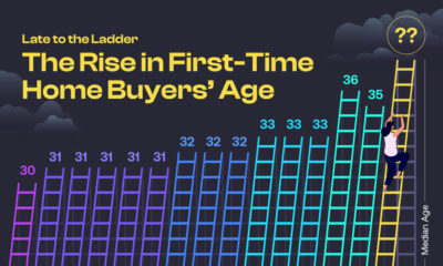
The median age of first-time home buyers has reached a historic high. See just how long it’s taking people to get on the property ladder.
 Markets12 months ago
Unpacking Real Estate Ownership by Generation (1991 vs. 2025)
Markets12 months ago
Unpacking Real Estate Ownership by Generation (1991 vs. 2025)
The Silent Generation’s share of real estate has dropped dramatically as people age, but how have Baby Boomers, Gen X, and Millennials fared?
 Business12 months ago
America’s Economic Engines: The Biggest Industry in Every State
Business12 months ago
America’s Economic Engines: The Biggest Industry in Every State
Real estate is the biggest industry by GDP in 26 states. Find out why it dominates—and what fuels the rest of the country.
 Maps1 year ago
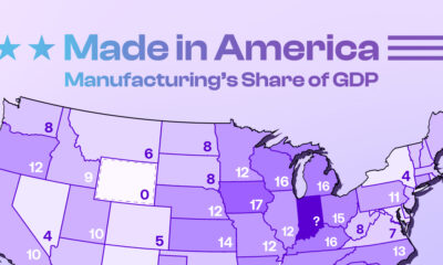
Mapped: Manufacturing as a Share of GDP, by U.S. State
Maps1 year ago
Mapped: Manufacturing as a Share of GDP, by U.S. State
Tariffs are rising to boost American-made goods. Which states gain the most—and least—from manufacturing today?
 Technology1 year ago
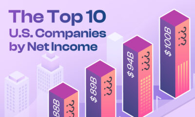
Profit Powerhouses: Ranking The Top 10 U.S. Companies by Net Income
Technology1 year ago
Profit Powerhouses: Ranking The Top 10 U.S. Companies by Net Income
Collectively, the ten most profitable U.S. companies have a net income of $684 billion—more than the entire GDP of Belgium.
 Money1 year ago
Millionaire Hubs: Mapping the World’s Wealthiest Cities
Money1 year ago
Millionaire Hubs: Mapping the World’s Wealthiest Cities
New York City has the highest millionaire population globally. Which other cities attract the world’s wealthiest?
 Economy1 year ago
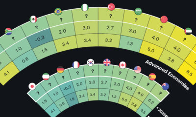
Tomorrow’s Growth: GDP Projections in Key Economies
Economy1 year ago
Tomorrow’s Growth: GDP Projections in Key Economies
The global economy is expected to have slighter slower growth going forward. Which countries are on track to have the biggest GDP increases?
 Money1 year ago
Mapped: Interest Rates by Country in 2025
Money1 year ago
Mapped: Interest Rates by Country in 2025
The U.S. has kept their target rate the same at 4.25-4.50%. What do interest rates look like in other countries amid economic uncertainty?
 Markets1 year ago
U.S. Housing Prices: Which States Are Booming or Cooling?
Markets1 year ago
U.S. Housing Prices: Which States Are Booming or Cooling?
The national housing market saw a 4.5% rise in house prices. This graphic reveals which states had high price growth, and which didn’t.
 Investor Education1 year ago
The Silent Thief: How Inflation Erodes Investment Gains
Investor Education1 year ago
The Silent Thief: How Inflation Erodes Investment Gains
If you held a $1,000 investment from 1975-2024, this chart shows how the inflation rate can drastically reduce the value of your money.
 Politics1 year ago
Trade Tug of War: America’s Largest Trade Deficits
Politics1 year ago
Trade Tug of War: America’s Largest Trade Deficits
Trump cites trade deficits—the U.S. importing more than it exports—as one reason for tariffs. Which countries represent the largest deficits?