Visual Capitalist’s Top 25 Visualizations of 2025
Published
40 minutes agoon
December 30, 2025The world moved fast in 2025. And so did the data.
From the AI boom (and the infrastructure behind it) to shifting trade dynamics, our team published hundreds of charts and maps designed to help readers quickly understand what matters most.
Many of this year’s standout visuals shared one thing in common: they revealed hidden scale—whether it was Africa’s true size, the sheer output of the world economy, or how a handful of regions, people, and companies dominate the numbers we live by.
🔮🔮🔮 What does 2026 have in store?We’ve analyzed thousands of predictions about next year in the VC+ Global Forecast Series. Sign up to become a VC+ member before Jan 1 and get a free gift!
In this yearly round-up, we’ve highlighted a small selection of our most impactful work.
The following visualizations were selected because they reached millions of people, sparked lively conversations, or stood out for clarity, relevance, and design. Let’s dive in!
Editor’s note: Click on any preview below to see the full-sized version of a visualization.
#25 How Much Power Do Data Centers Use? 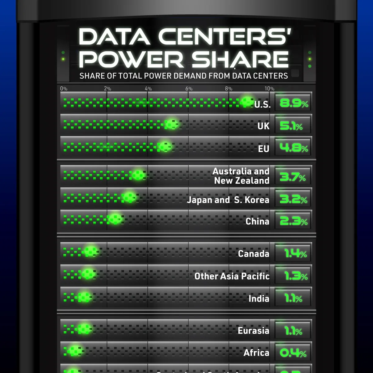
AI didn’t just transform software in 2025.
It kicked off a hyperscaler buildout, and that buildout has a real energy footprint.
This visual shows how data centers already use about 8.9% of U.S. electricity, with projections pointing higher over the next few years.
#24 The Smartest AI Models, by IQ 
This was published earlier in the year, but it still captures a defining theme of 2025.
AI models are getting shockingly capable, shockingly fast.
By comparing leading models on an IQ-style benchmark, the chart makes the “how smart is smart?” question feel very real.
#23 Europe’s Top Economies in 2026 by Projected GDP 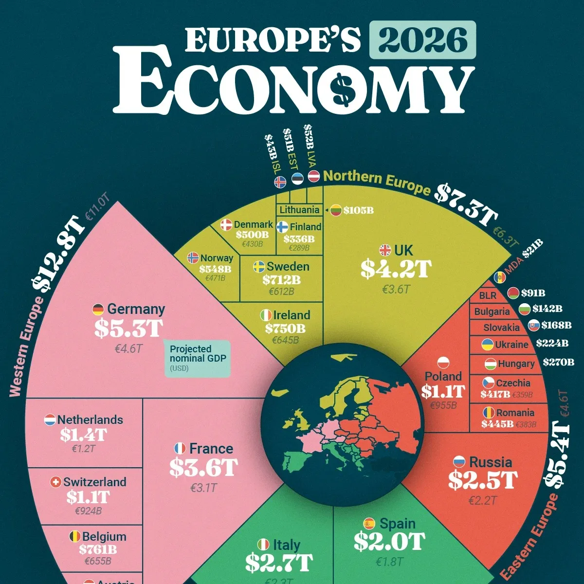
This one stood out for its structure as much as its numbers.
Countries are organized by where they sit regionally in Europe (North, West, South, and East).
Then they’re sized by projected GDP, making Europe’s economic center of gravity obvious at a glance.
#22 The Best-Selling Video Games Since 2020 
A post-pandemic era deserves a post-pandemic snapshot.
This radial chart shows which titles and franchises dominated sales since 2020.
And it highlights a familiar pattern in entertainment: a small number of megahits tower over everything else.
#21 How Many Countries Fit in Africa? The Continent’s True Size 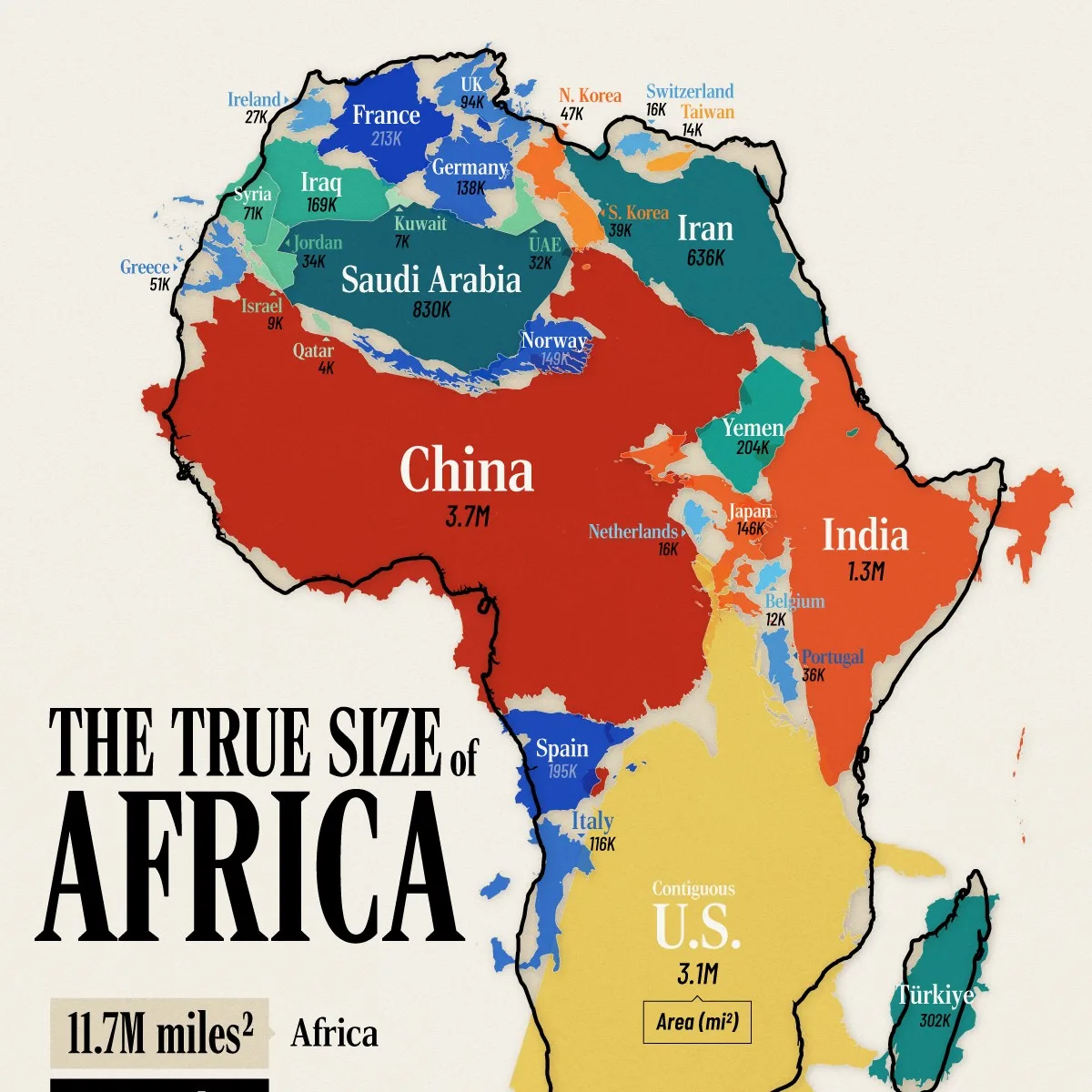
This is a classic visualization that we re-did.
And it still captures people’s imagination every time.
By overlaying entire countries onto Africa, it helps correct the mental distortion created by common map projections.
#20 The World’s Largest Economies, Including U.S. States 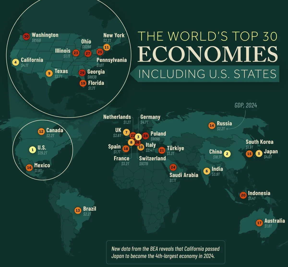
A big economic milestone helped inspire this one.
Earlier in the year, California climbed high enough to rank as the world’s fourth-largest economy.
So we compared countries and U.S. states side-by-side, showing how enormous sub-national economies can be.
#19 How Much Control China Has Over the World’s Critical Minerals 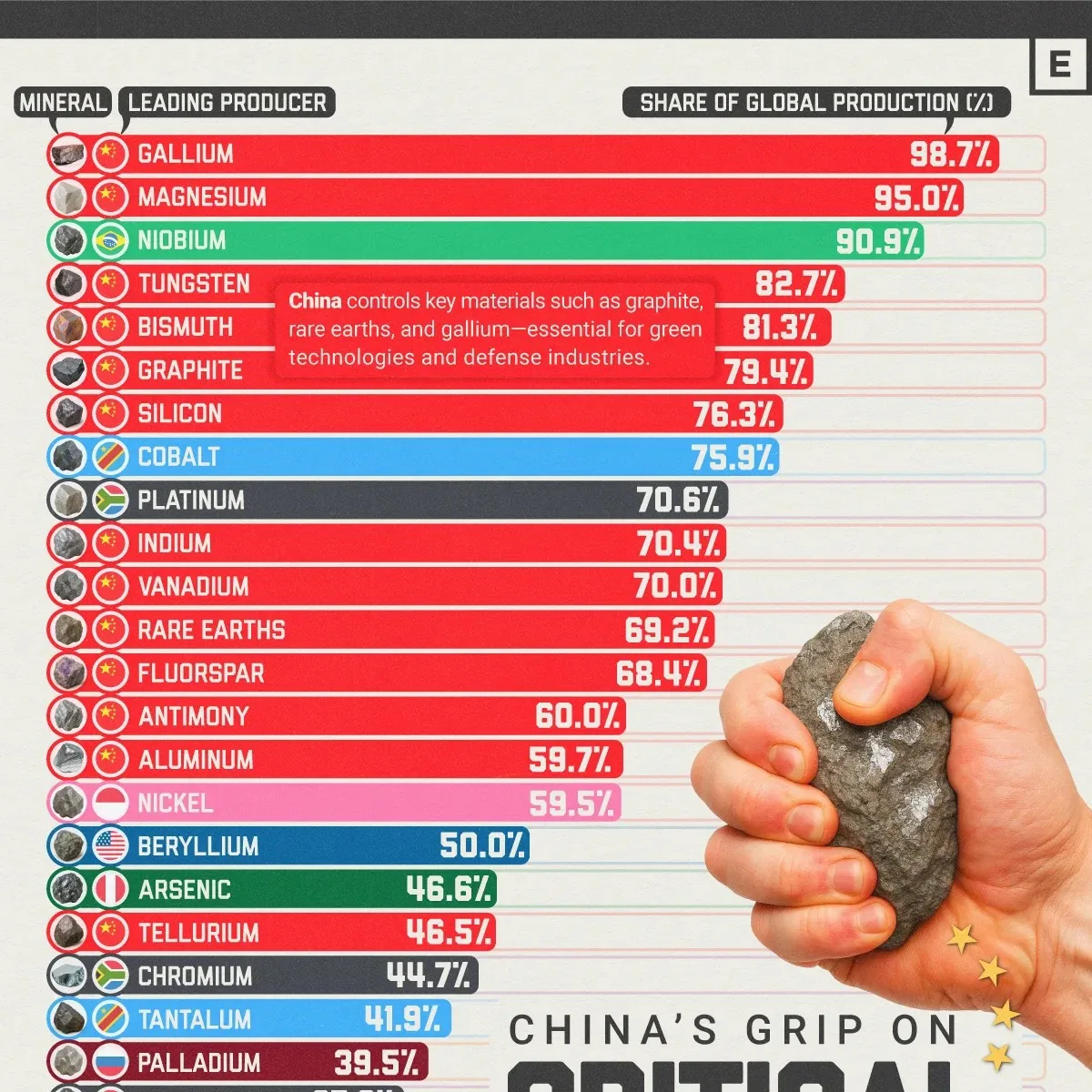
Critical minerals sit at the intersection of tech, defense, and energy.
This infographic shows why the topic is also geopolitical.
China dominates both production and refining for multiple key minerals, creating a potential supply-chain pressure point for the rest of the world.
#18 The World’s Fastest Shrinking Countries 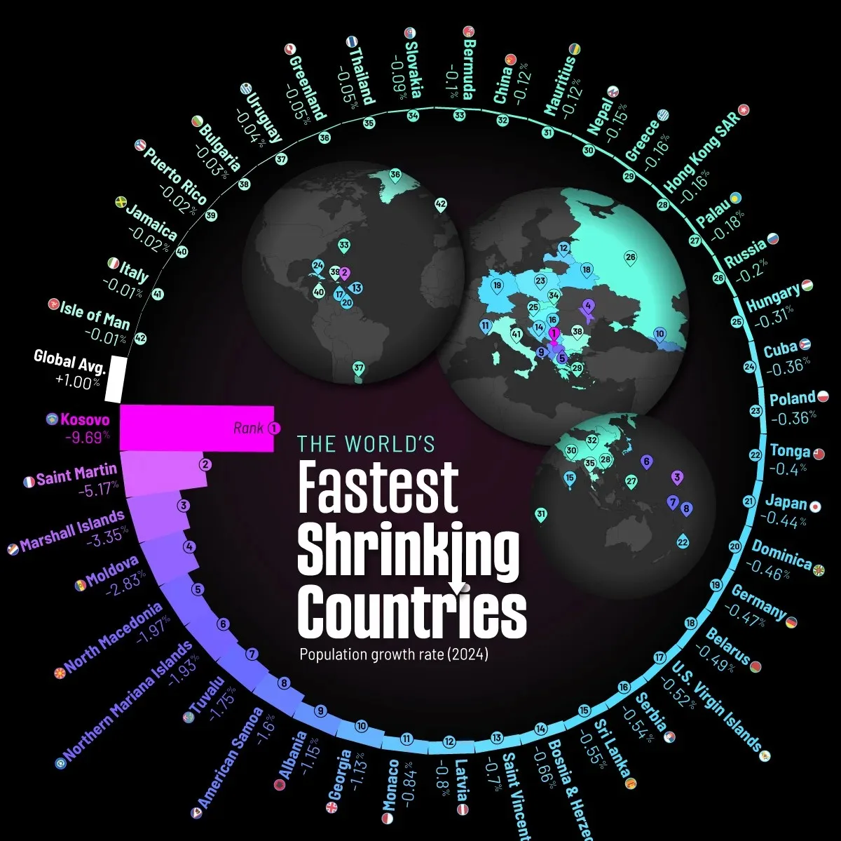
Demographic shifts were one of the key themes of 2025.
Fertility rates are falling, and more countries are entering population decline.
This ranking shows where shrinkage is happening fastest, and hints at what it could mean for labor markets and long-term growth.
#17 All of the World’s Births in 2025 in One Giant Chart 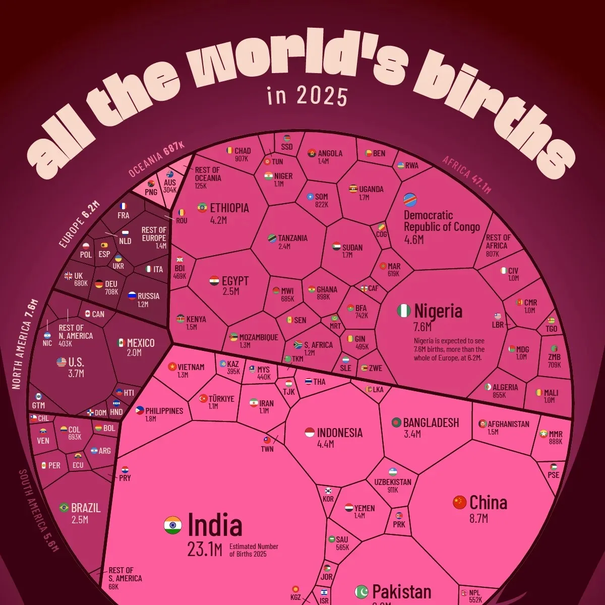
This chart makes global demographic momentum impossible to ignore.
The vast majority of births in 2025 occurred in Africa and Asia.
Meanwhile, North America and Europe account for only a tiny slice of the world’s newborns, shaping very different futures across regions.
#16 How Coca-Cola’s Secret Formula Has Changed Over Time 
A pop-culture brand story, with a timely twist.
After political pressure pushed Coca-Cola to introduce a cane sugar variant in the U.S., we looked backward.
This timeline compares Coke recipes over time, showing that the “secret formula” hasn’t been as static as people assume.
#15 Visualizing the Top 10 Global Risks (2020-2025) 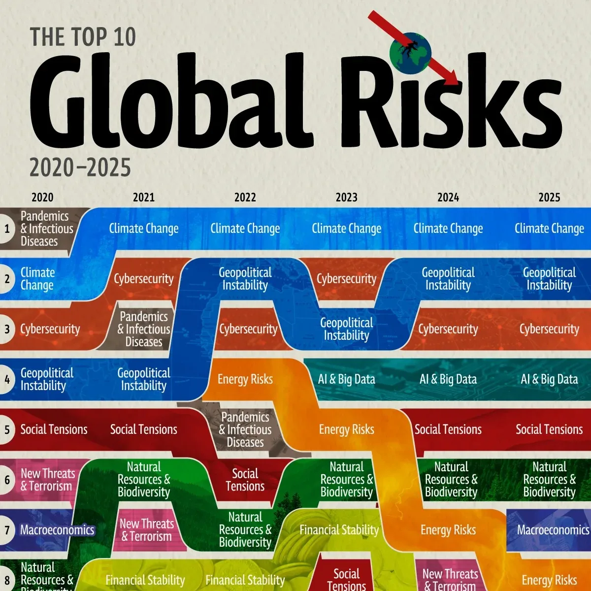
What the world worries about changes year to year.
This visualization tracks that evolution across the first half of the decade.
It’s a simple way to see which risks are fading, which are rising, and which are becoming permanent fixtures.
#14 Every Country’s Richest Billionaire in 2025 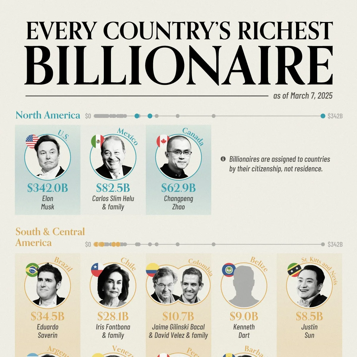
This is a massive infographic that identifies the richest billionaire in every single country.
Beyond the names, the list makes a bigger point about wealth concentration, and how unevenly billionaire capital is distributed globally.
#13 The World’s Largest Coal Producing Countries in 2024 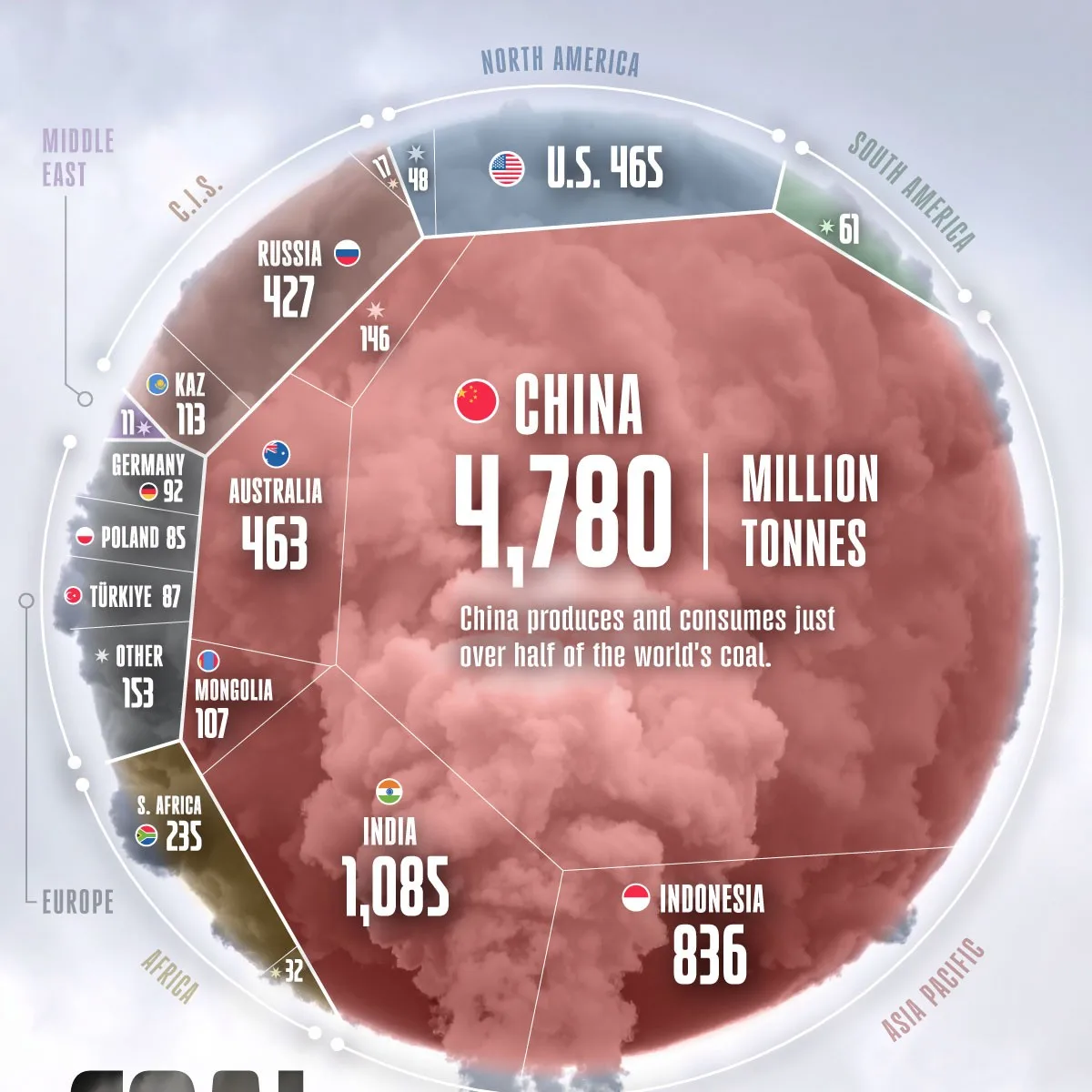
The data is important here, but also the design is particularly memorable.
When many people think of coal, they are also thinking of the impact it has on air quality. And this design takes that into consideration, creating a circular smoke ring that gets divvied up based on country coal production.
#12 Every State’s Share of U.S. GDP 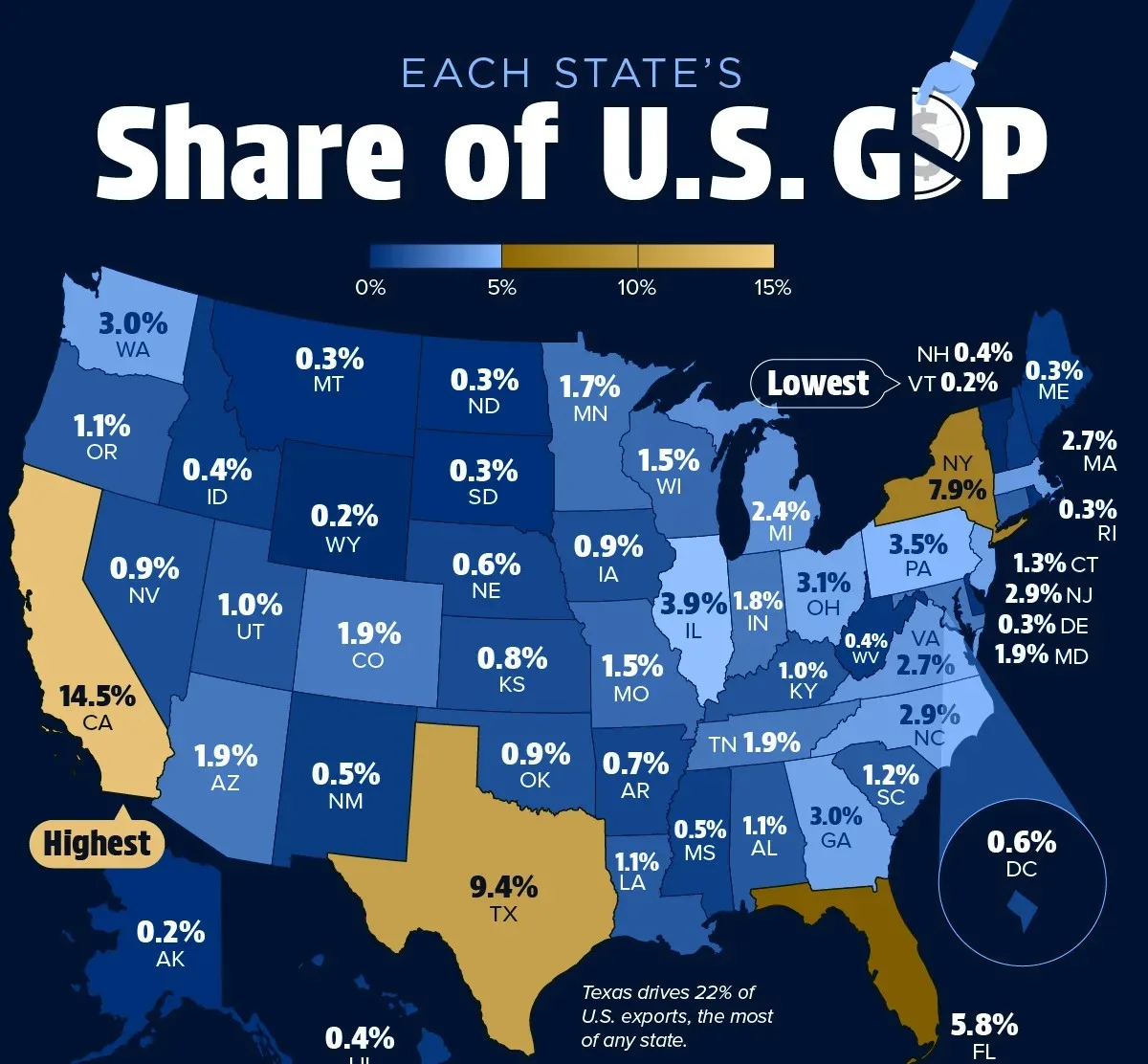
Most people think about GDP at the country level.
But state-level GDP is one of those unanswered questions people don’t realize they have.
This mosaic answers it quickly, showing how concentrated U.S. economic output really is across just a handful of states.
#11 The Most Reliable Car Brands in 2025 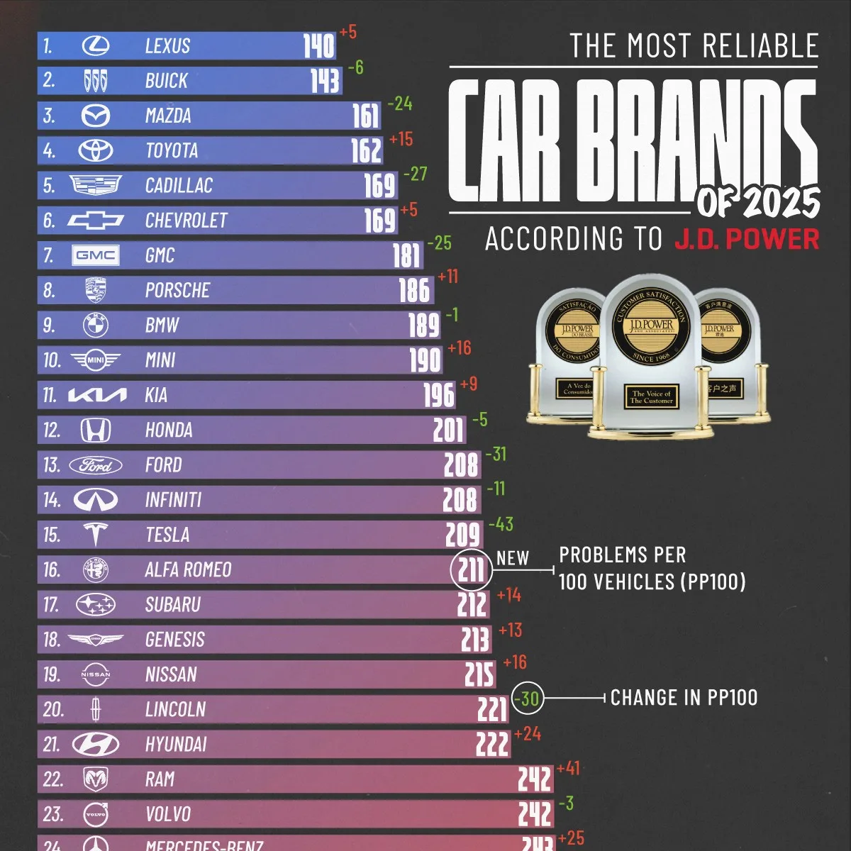
This was one of our most-read posts of the year, clearing 1.1 million views.
That tells you the topic resonated, and the ranking format made it easy for readers to find and share the results.
#10 Salary by Education Level in the United States 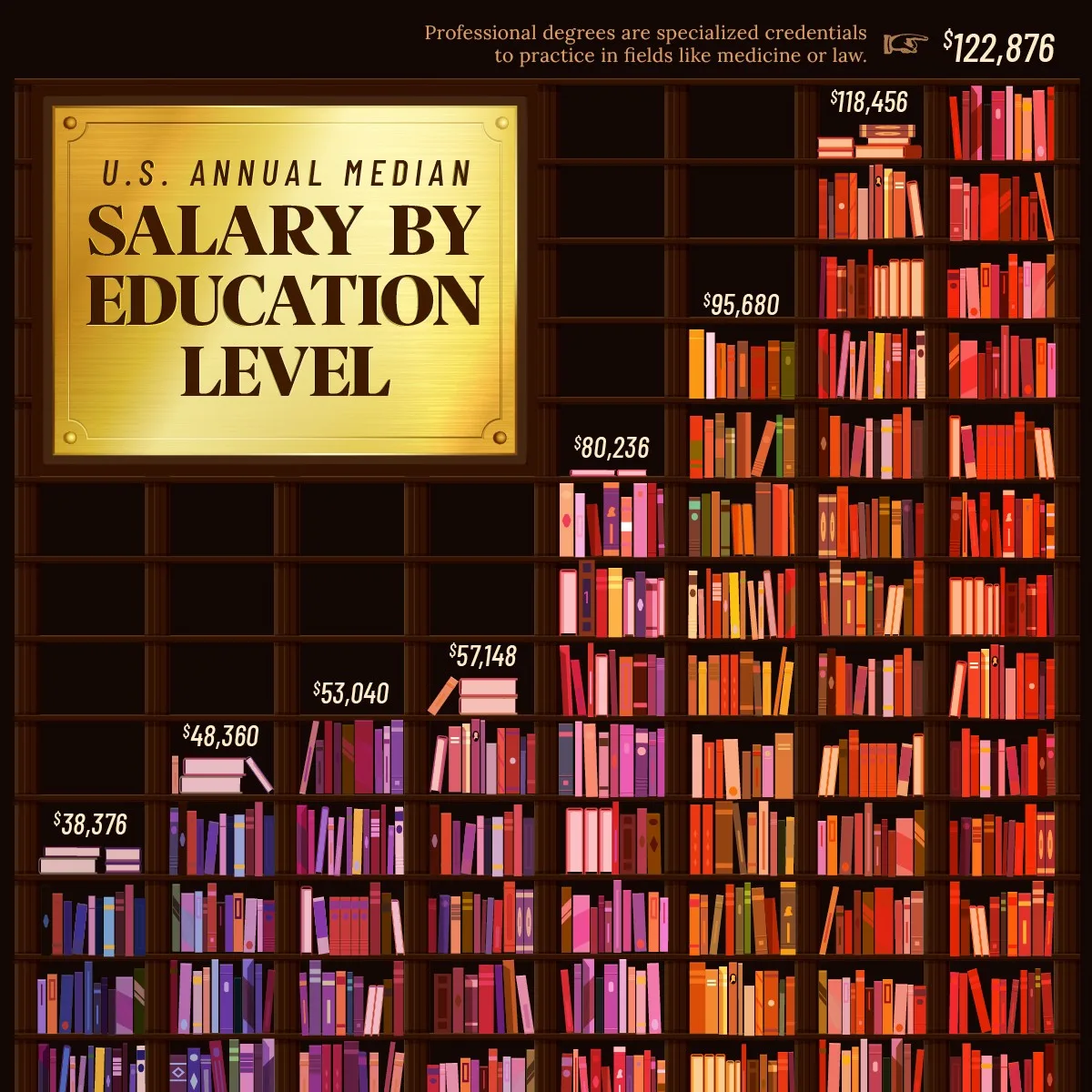
The link between education and pay is well known, but this chart makes it feel even more concrete.
It also stands out visually, using stacked books to turn a familiar statistic into something people stop scrolling for.
#9 The World’s Most Profitable Companies in 2025 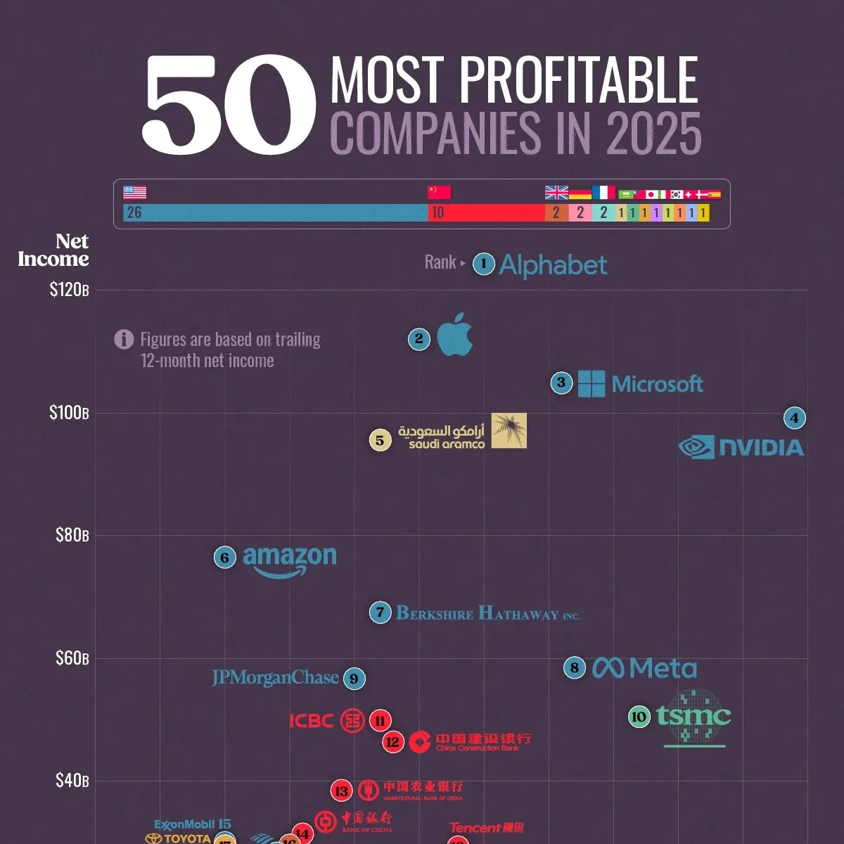
This is an 80/20 list in the truest sense.
A handful of companies are clear outliers.
The ranking makes modern corporate power visible, and shows how profitability is concentrated among a small group of tech and oil giants.
#8 Which Countries Hold the Most Gold Reserves? 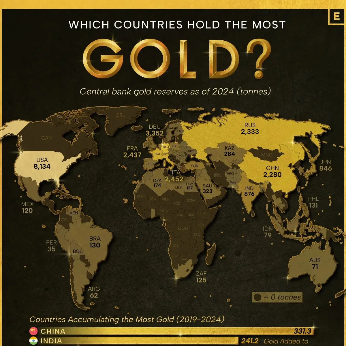
Gold surged in 2025, reaching new highs.
So naturally, this map felt especially relevant.
It shows which countries hold the largest reserves, and which governments have the biggest “hard asset” backstops.
#7 Countries With the Best Reputations in 2025 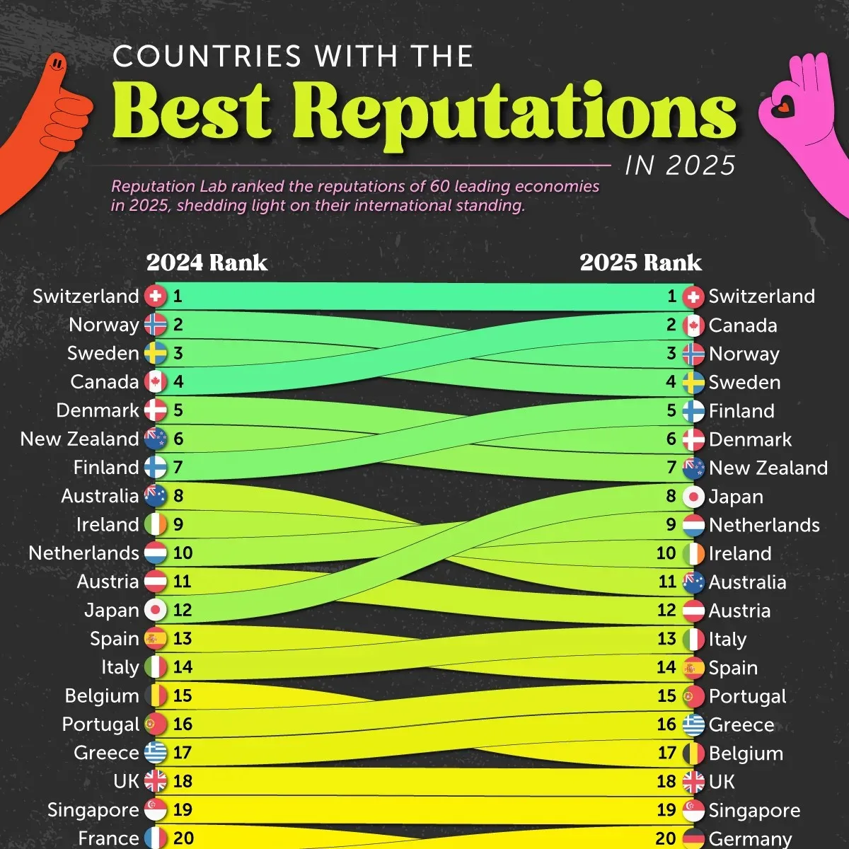
Soft power matters, and it can shift quickly.
In 2025, amid foreign policy changes, the U.S. saw a major drop in international reputation, while countries like Switzerland and Canada remained strong at the top.
#6 The 1%’s Share of U.S. Wealth Over Time (1989-2024) 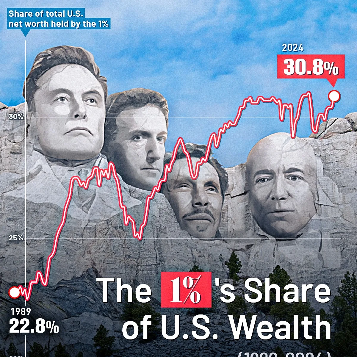
This was a standout partly because of the visualization approach.
It uses a Mount Rushmore-style design to tell a very modern story.
And beneath the style, it’s tracking a long-term trend: the steady rise in wealth concentration at the top.
#5 Top 40 Jobs at Risk From AI 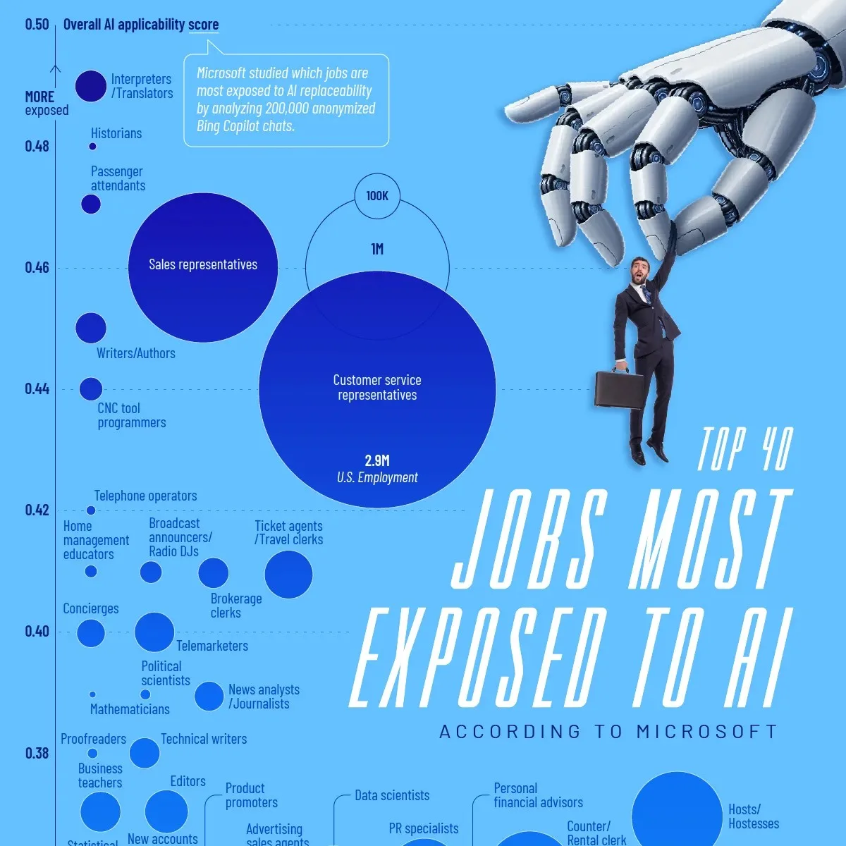
Jobs and AI were central to the zeitgeist in 2025.
This scatterplot highlights which occupations are most exposed based on task overlap with generative AI.
It helped readers see something counterintuitive: many high-paying, white-collar roles rank as more exposed than hands-on jobs.
#4 The Top Import Partner of Every U.S. State 
Trade and tariffs were one of the biggest topics to kick off the year.
This visual helped make that story relevant on a more local level to many viewers: it shows each state’s top import partner, and it resonated strongly, pulling in 862,000 views.
#3 The Most Educated Populations, Across 45 Countries 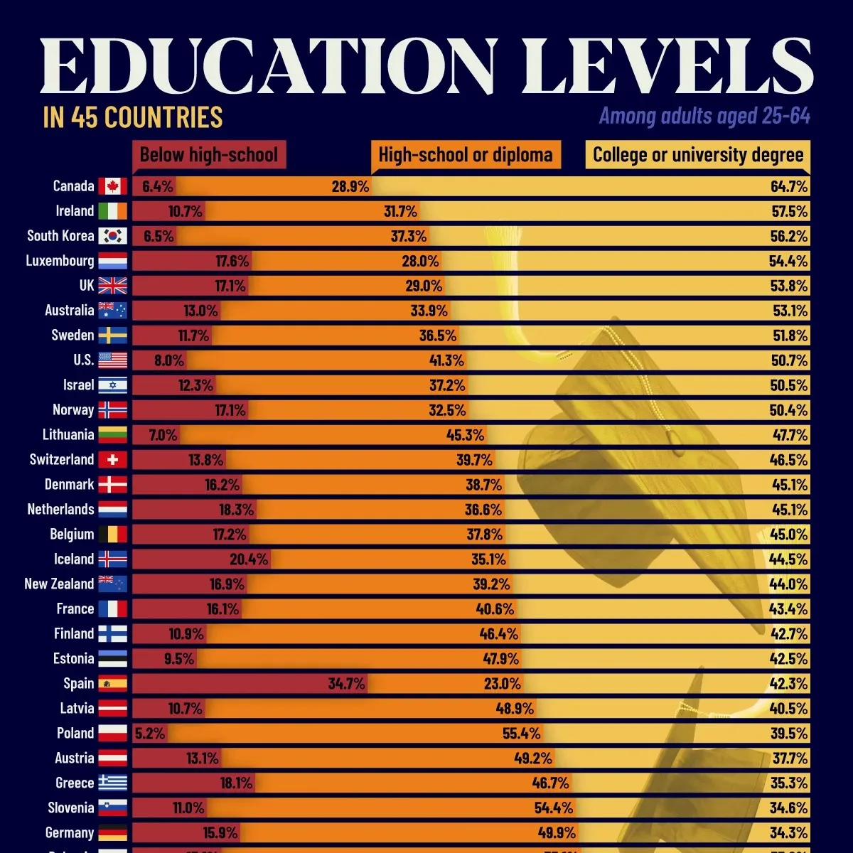
This was our most popular post of the year, reaching 1.7 million views.
Education continued to be a key topic on the Visual Capitalist website, partially because the impact of AI on the future of learning and work is still up in the air.
#2 The World’s 30 Most Powerful Rivers 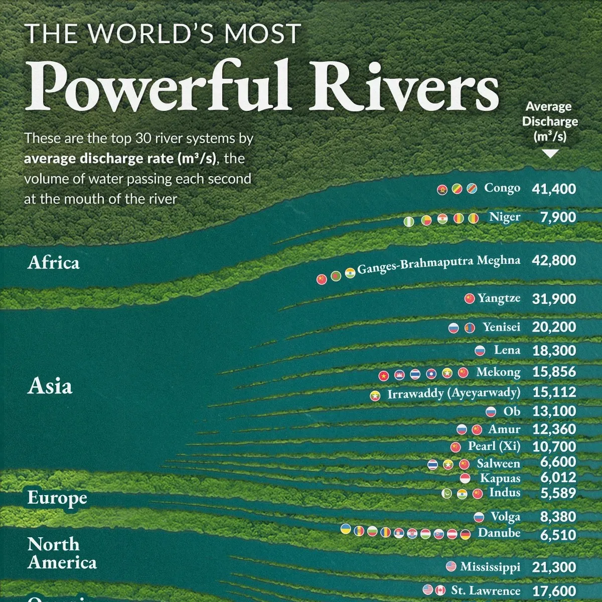
This is one of our most unique visuals of the year. It uses a striking satellite-like effect, with rivers cutting through forests.
Those rivers are scaled by discharge, turning a geography lesson into something that feels alive.
The data is just as compelling. The Amazon is in a category of its own, with average discharge around 209,000 to 224,000 m³ per second. That’s about 20% of global river flow.
The next most powerful systems trail far behind, which makes the visualization feel like a genuine “wow” moment.
#1 The $117 Trillion World Economy in One Giant Visualization 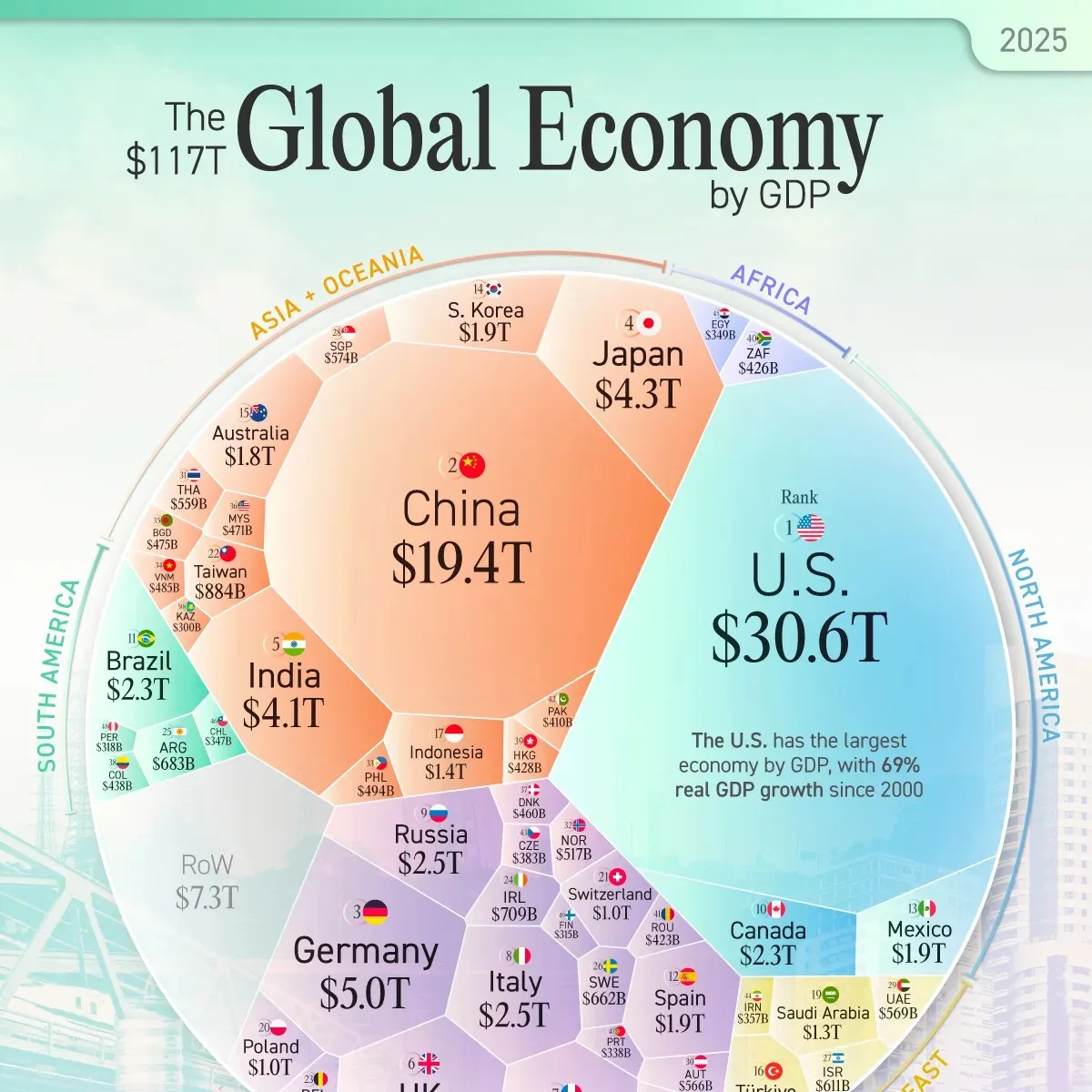
When you can see the entire world economy in one place, you instantly understand its size and scale, along with the big contrasts between blocs and countries.
The U.S. remains the largest economy at roughly $30.6 trillion, but the visual also makes it easy to spot momentum. India’s economy reached roughly $4.1 trillion in 2025 and is on track to climb further in the global rankings.
And beyond the numbers, this year’s edition just looks great.
The color palette and design choices make it something readers want to stare at, and share.